
Drag'n Survey
I was given the opportunity to do freelance work as a UX / UI designer for a startup called Dragn' Survey. They aim to provide online surveys tailored to the needs of different job areas with one of the simplest user experiences there is. With another designer who specialised in UI on this mission, we were tasked to redesign the marketing website, imagine a new branding for Dragn' Survey and make sure users would understand the value brought by this tool on a pretty competitive market.
The context
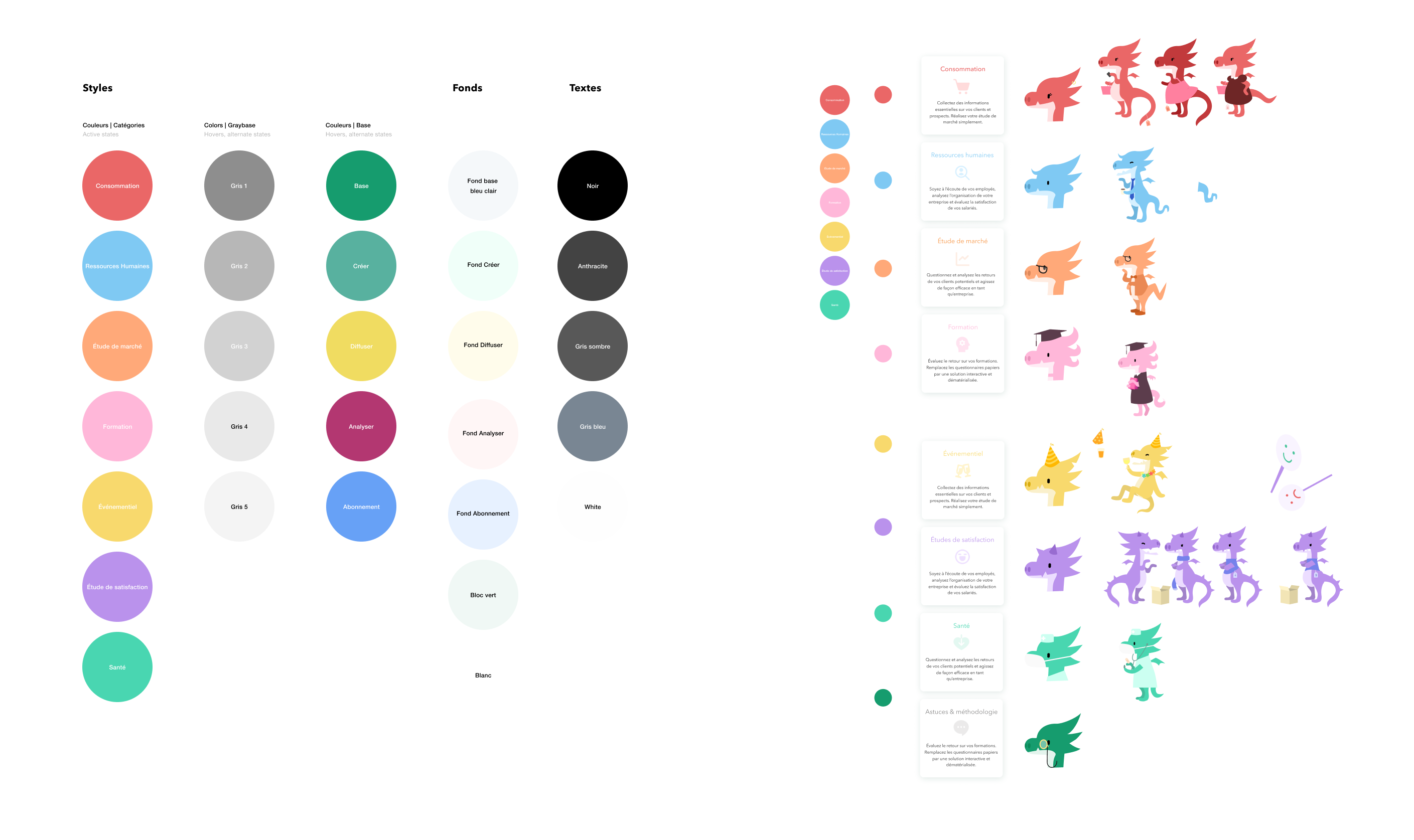
For this mission, our client already knew about their audience and how he wanted to adress them. However they lacked meaningful ways to reach them and let them see and understand how their tool was better than the competition. Since the project didn't call for user research, we went through learnings they had already gathered through their existance as well as website and tool data they had of their present users. This is how we learned the best strengths their product had; it was perceived as simpler than other tools by a good margin of users. We decided to give this easier and more approachable feeling a face. This is how Sir V was born ! He conveys simplicity while sqtill changing and adapting to better reflect targeted users through their professions or tasks. We created customable templates for users to have a heads start when building a survey in some given fields, while Sir V changed in style to better suit the area.
Making the website simpler also meant bringing this simplicity upfront to increase user enrolment, our client's main KPI for this project. We simplified the sign in and sign up process, and created custom landing pages to entail focused flows preventing user attrition as much as possible.

The process
Working with a small client — a startup moreover — meant working in a lean, fast environement. We spent a few days gathering learnings and leading competitive analysis, but set out to build and test flows as fast as possible to learn faster. We created many low fidelity flows, which we then turned into high fidelity mock-ups to present our client and even beta testers to gather more feedback and iterate. At this point we started integrating branding elements and even layed the foundations of a design system to be used when the tool itself will go intt it's own rebuilding phase at some point later. Even though the present result is far from perfect, the marketing website and tool have come a long way since their launch and KPIs show they're headed in the right direction!